As the president of the student-run organization, Thunderbird Marketing Association, I find myself in a quandry. I have to apply the material learned to a service-oriented group of students. A brief history: recently, three student clubs were changed into "associations" in order to develop a more professional character. These three groups also espouse the three foci within Thunderbird's program. We were left with a logo and brand identity that was . . . well. . . mediocre. I understand that it is a student organization and school-related. But, that doesn't mean that it can't be a professionally run and organized entity. As we communicate with others, namely potential sponsors, mentors, and members, we really need to put our best foot forward and show that this is a professional organization, here to add to the student's campus life and to give value to his or her education at Thunderbird. So not only am I in a strategy conundrum, but also a branding one. 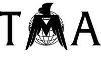 Currently the TMA, as the Marketing Association is affectionately known by students and staff alike, uses this logo (to the left). Not that it's a bad logo, but I don't think it correctly ties the TMA to the principles of the organization: education, and application thereof. Other key components of the organization might include student development, global thought leadership, cross-cultural understanding. How do you convey these thoughts into an image? More importantly, can we make the logo look more professional? We asked the guys at LogoWorks.com to freshen up the look of the TMA. We told them that we'd like to keep the relationship between Thunderbird and the TMA visible and that we need something professional and noticeable. Of course, tying back into the educational aspect of the school would be nice, but not necessarily a priority. Three days later, they delivered. They gave us five options from which to choose. Once we choose one of these concepts, it will go into reconstruction according to our terms. I was very impressed with the quality of work offered in that short three days. The problem is, how do we decide which to employ?

The first offers a great element of a thunderbird and its dedication to education. The icon can be hard to decipher at first, but once seen is very recognizeable. The soft typeface gives the association a new feel, but may be too soft. A good start.
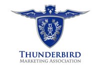
The second concept really goes out on a limb. It takes the idea of the Thunderbird and puts it on a new level of a progressive icon. It uses a crest to give it that educational feel and really nails the educational, elite feel with the typeface. The bird may be a little too harsh, but it has a nice feel. This is one of my favorites.

Third: The feel of this logo is very professional. It allows the name of the association to play as the icon as well. The subtlety of the thunderbird within the 'A' is very nice. On the downside, this logo makes me think of the airline industry. Solid, but is it what we're looking for?

The next concept gives us a new idea on the wing. This returns to a softer image, but feels slightly more professional than the first. It lends itself to a variety of applications, but not as many as the second or third choice. On the downside, it looks kind of cookie-cutter... we'll see.
Last but not least, is this option. This is pretty solid. It gives us a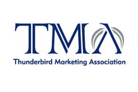 play on the 'A' with the wings using the apex of the 'A' as the head of the bird. It's a strong feel with the iconish TMA, and the typeface is very simple.
So, there's the logo side to my problem. They are all decent choices, but I need to figure out which one best represents my organization. When it comes down to it, I've got to ask myself, "What does the TMA represent?" "What is our product?" "Who is our customer, and what would they like to see?" I think the answer to the first is rather straightforward. The TMA is a branch, a subsidiary if you will, of an educational system. It is an entity that provides an outlet for application of acquired knowledge. An outlet to the educational system that provides the best global leadership program in the world - Thunderbird. So, I guess that means, before marketing, we should represent Thunderbird and Applied Knowledge.
The answer to the second is probably the most vague. What is our product? I guess, it's a combination of services. We'll come back to this one.
Finally, our customer is three-fold: Members, Sponsors, and Recruiters. Members want to be represented by something that they can be proud to show. Not the case with the existing logo. Sponsors and Recruiters kind of fit in the same bunch. Both need to be approached by a professional who looks professional.
That's where we sit. Your comments would be very much appreciated. I'll keep you posted on how this quandry turns into a quagmire... or not.

The first offers a great element of a thunderbird and its dedication to education. The icon can be hard to decipher at first, but once seen is very recognizeable. The soft typeface gives the association a new feel, but may be too soft. A good start.

The second concept really goes out on a limb. It takes the idea of the Thunderbird and puts it on a new level of a progressive icon. It uses a crest to give it that educational feel and really nails the educational, elite feel with the typeface. The bird may be a little too harsh, but it has a nice feel. This is one of my favorites.

Third: The feel of this logo is very professional. It allows the name of the association to play as the icon as well. The subtlety of the thunderbird within the 'A' is very nice. On the downside, this logo makes me think of the airline industry. Solid, but is it what we're looking for?

The next concept gives us a new idea on the wing. This returns to a softer image, but feels slightly more professional than the first. It lends itself to a variety of applications, but not as many as the second or third choice. On the downside, it looks kind of cookie-cutter... we'll see.
Last but not least, is this option. This is pretty solid. It gives us a
 play on the 'A' with the wings using the apex of the 'A' as the head of the bird. It's a strong feel with the iconish TMA, and the typeface is very simple.
So, there's the logo side to my problem. They are all decent choices, but I need to figure out which one best represents my organization. When it comes down to it, I've got to ask myself, "What does the TMA represent?" "What is our product?" "Who is our customer, and what would they like to see?" I think the answer to the first is rather straightforward. The TMA is a branch, a subsidiary if you will, of an educational system. It is an entity that provides an outlet for application of acquired knowledge. An outlet to the educational system that provides the best global leadership program in the world - Thunderbird. So, I guess that means, before marketing, we should represent Thunderbird and Applied Knowledge.
The answer to the second is probably the most vague. What is our product? I guess, it's a combination of services. We'll come back to this one.
Finally, our customer is three-fold: Members, Sponsors, and Recruiters. Members want to be represented by something that they can be proud to show. Not the case with the existing logo. Sponsors and Recruiters kind of fit in the same bunch. Both need to be approached by a professional who looks professional.
That's where we sit. Your comments would be very much appreciated. I'll keep you posted on how this quandry turns into a quagmire... or not.
Know More...
- I'm Sherwoods
- From United States
- A week after meeting...an engagement ring. Three months after the engagement ring...a wedding. Four years after the wedding...Zachary. 15 months after Zachary...Andrew. 18 months after Andrew...Tyson. Eight years later...one happy, eternal family!
- My profile
0 Responses to “To Rebrand or Not?”
Leave a Reply