Updating 101
Published Wednesday, August 22, 2007 by Sherwoods.
So, it's been a while since my last post. I have every intention on updating more frequently, but work, family, and life in general come first. Hopefully, I'll think of something semi-intelligent in the next week.
Done with Grad School, and now for real work
Published Friday, December 29, 2006 by Sherwoods.
So it's been six months since my last post. I've graduated from Thunderbird, taken a job at Bristol-Myers Squibb and been inundated with information regarding drugs, mechanism of disease states, anatomy, physiology, and all the other trimmings that accompany the pharma industry. Pharma is an interesting bag of tricks. Where else do marketers so seldomly use the products they are so passionately promoting? Where else do sales representatives become so limited as to what they can say and do? It's interesting and fun. I enjoy working with pharma because it is completely foreign. . . not for long.
Stay tuned.
Stay tuned.
Really good vs. Really bad.
Published Sunday, July 30, 2006 by Sherwoods.
So in as little as one minute I saw some of the worst advertising to some of the best of the year: at least in my opinion. Let's explore.
Talladega Nights: The Ballad of Ricky Bobby doesn't look to be a blockbuster, though Will Farrell does have his fair share of fans. However, the movie and the critique thereof is not the focus of this post. The intelligent marketing and cross-promotion, however, is. Sprint-Nextel has launched a new campaign that includes shots of "Ricky Bobby" in different parts of his house using his Sprint-Nextel phone. Wait a minute... doesn't Nextel sponsor Nascar? Oh, I think it does. So the mixing of "genres," if you will, works rather well. Sports, Telecommunications, and Box Office work pretty well together. At least in this example. Sprint seems to have lost its cloaked stranger for a comedian. Will it pay off? Will Will help the business-oriented, convenience-factor-laden company gain a new market segment in the Nascar lover? It remains to be seen.
On the other hand, and in the other half minute I choked down cable TV today, I saw what I would nominate as the absolute poorest advertisement of the year. The entire campaign makes me sick and the mixing of these two genres is like a bad Bertie Bott's Every Flavor Jelly Bean. Mercedes Benz' new campaign involves Americana-type music **enter jukebox** and something or another about the American dream. Wait another minute... when did Mercedes become American? Daimler-Chrysler, sure. But, they still have Jeep, Dodge, Chrysler to p ull the American card with. I mean, you could even launch the 4-wheel drive car/truck AMC Eagle again. But, why in the name of all that is holy would Mercedes claim to be part of the American dream complete with American Rock n' Roll? Somebody, please help me understand this.
Talladega Nights: The Ballad of Ricky Bobby doesn't look to be a blockbuster, though Will Farrell does have his fair share of fans. However, the movie and the critique thereof
 is not the focus of this post. The intelligent marketing and cross-promotion, however, is. Sprint-Nextel has launched a new campaign that includes shots of "Ricky Bobby" in different parts of his house using his Sprint-Nextel phone. Wait a minute... doesn't Nextel sponsor Nascar? Oh, I think it does. So the mixing of "genres," if you will, works rather well. Sports, Telecommunications, and Box Office work pretty well together. At least in this example. Sprint seems to have lost its cloaked stranger for a comedian. Will it pay off? Will Will help the business-oriented, convenience-factor-laden company gain a new market segment in the Nascar lover? It remains to be seen.
On the other hand, and in the other half minute I choked down cable TV today, I saw what I would nominate as the absolute poorest advertisement of the year. The entire campaign makes me sick and the mixing of these two genres is like a bad Bertie Bott's Every Flavor Jelly Bean. Mercedes Benz' new campaign involves Americana-type music **enter jukebox** and something or another about the American dream. Wait another minute... when did Mercedes become American? Daimler-Chrysler, sure. But, they still have Jeep, Dodge, Chrysler to p
 ull the American card with. I mean, you could even launch the 4-wheel drive car/truck AMC Eagle again. But, why in the name of all that is holy would Mercedes claim to be part of the American dream complete with American Rock n' Roll? Somebody, please help me understand this.
Four months later...
Published Tuesday, July 04, 2006 by Sherwoods.
Is America a brand? What about the Fourth of July? Old Navy and the like sure would like to think so. They've commercialized just about every holiday now.
Almost four months after my last post, I realize I'm a little behind. No worries, good things have happened. I have accepted a job on the east coast, and am very much looking forward to the challenge that the pharma industry has to offer.
Academically, I've continued to study marketing, but with an interesting twist. Instead of straight brand, I've branched into product development. Now, some may say they are not the same, but I would beg to differ. Okay, maybe not the same, but there are definite similarities. Through the development of a product, there needs to be an attention to the story of the product. This story makes the brand. If I can't deliver on the physical characteristics of a well-known branded product, is it really that product. For example, an iPod in a Creative Zen housing isn't really an iPod now is it? Apple knows what looks like an Apple and they stay away from the oranges.
Anyway, ramblings of the grad student will continue later.
What does an International Brand Manager read?
Published Tuesday, March 14, 2006 by Sherwoods.
I thought you'd never ask. Click here to see what I've read or meant to read lately that is taking up too much room in my apartment. I ship within 24 hours. This link is also available in the links section.
Good luck
Good luck
And the winner is...
Published Tuesday, February 07, 2006 by Sherwoods.
After much deliberation and mediation, we have found our winner. We thought that the ideas from LogoWorks were great. Very professional, and almost on target. The misses came from our lack of conveying the proper idea. This logo ties us in directly to the school. We are very pleased. Now, you might ask, why did you go through that exacerbated process just to come back to the school's logo with new copy? That's a great question. To make a very long story short; we made the same mistake that I think many companies make when they try to start a new line or service. The product managers are tired of the same old thing and want something new and exciting. Take Starbuck's for example. I'm sure when they launched their liqueur line, product managers were screaming for new identity, but in the end, it has the same logo tying it back to its parent. We needed to do the same. And with the help of a few key individuals with much more advertising and branding experience that the rest of us, they helped us understand that. Not only does this work for our association, but the same logo can be used for the Finance Association and the International Development Association as well. Lesson learned: continuity and preservation of brand identity is critical to the success of what would otherwise be a fractured organization.
Thanks again to the following: LogoWorks, Rick Baer, Phil Schlesinger, and Kristen Jarchow.
To Rebrand or Not?
Published Monday, January 09, 2006 by Sherwoods.
As the president of the student-run organization, Thunderbird Marketing Association, I find myself in a quandry. I have to apply the material learned to a service-oriented group of students. A brief history: recently, three student clubs were changed into "associations" in order to develop a more professional character. These three groups also espouse the three foci within Thunderbird's program. We were left with a logo and brand identity that was . . . well. . . mediocre. I understand that it is a student organization and school-related. But, that doesn't mean that it can't be a professionally run and organized entity. As we communicate with others, namely potential sponsors, mentors, and members, we really need to put our best foot forward and show that this is a professional organization, here to add to the student's campus life and to give value to his or her education at Thunderbird. So not only am I in a strategy conundrum, but also a branding one. 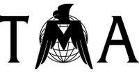 Currently the TMA, as the Marketing Association is affectionately known by students and staff alike, uses this logo (to the left). Not that it's a bad logo, but I don't think it correctly ties the TMA to the principles of the organization: education, and application thereof. Other key components of the organization might include student development, global thought leadership, cross-cultural understanding. How do you convey these thoughts into an image? More importantly, can we make the logo look more professional? We asked the guys at LogoWorks.com to freshen up the look of the TMA. We told them that we'd like to keep the relationship between Thunderbird and the TMA visible and that we need something professional and noticeable. Of course, tying back into the educational aspect of the school would be nice, but not necessarily a priority. Three days later, they delivered. They gave us five options from which to choose. Once we choose one of these concepts, it will go into reconstruction according to our terms. I was very impressed with the quality of work offered in that short three days. The problem is, how do we decide which to employ?

The first offers a great element of a thunderbird and its dedication to education. The icon can be hard to decipher at first, but once seen is very recognizeable. The soft typeface gives the association a new feel, but may be too soft. A good start.
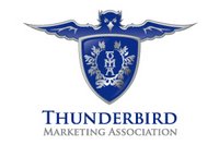
The second concept really goes out on a limb. It takes the idea of the Thunderbird and puts it on a new level of a progressive icon. It uses a crest to give it that educational feel and really nails the educational, elite feel with the typeface. The bird may be a little too harsh, but it has a nice feel. This is one of my favorites.

Third: The feel of this logo is very professional. It allows the name of the association to play as the icon as well. The subtlety of the thunderbird within the 'A' is very nice. On the downside, this logo makes me think of the airline industry. Solid, but is it what we're looking for?

The next concept gives us a new idea on the wing. This returns to a softer image, but feels slightly more professional than the first. It lends itself to a variety of applications, but not as many as the second or third choice. On the downside, it looks kind of cookie-cutter... we'll see.
Last but not least, is this option. This is pretty solid. It gives us a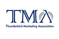 play on the 'A' with the wings using the apex of the 'A' as the head of the bird. It's a strong feel with the iconish TMA, and the typeface is very simple.
So, there's the logo side to my problem. They are all decent choices, but I need to figure out which one best represents my organization. When it comes down to it, I've got to ask myself, "What does the TMA represent?" "What is our product?" "Who is our customer, and what would they like to see?" I think the answer to the first is rather straightforward. The TMA is a branch, a subsidiary if you will, of an educational system. It is an entity that provides an outlet for application of acquired knowledge. An outlet to the educational system that provides the best global leadership program in the world - Thunderbird. So, I guess that means, before marketing, we should represent Thunderbird and Applied Knowledge.
The answer to the second is probably the most vague. What is our product? I guess, it's a combination of services. We'll come back to this one.
Finally, our customer is three-fold: Members, Sponsors, and Recruiters. Members want to be represented by something that they can be proud to show. Not the case with the existing logo. Sponsors and Recruiters kind of fit in the same bunch. Both need to be approached by a professional who looks professional.
That's where we sit. Your comments would be very much appreciated. I'll keep you posted on how this quandry turns into a quagmire... or not.

The first offers a great element of a thunderbird and its dedication to education. The icon can be hard to decipher at first, but once seen is very recognizeable. The soft typeface gives the association a new feel, but may be too soft. A good start.

The second concept really goes out on a limb. It takes the idea of the Thunderbird and puts it on a new level of a progressive icon. It uses a crest to give it that educational feel and really nails the educational, elite feel with the typeface. The bird may be a little too harsh, but it has a nice feel. This is one of my favorites.

Third: The feel of this logo is very professional. It allows the name of the association to play as the icon as well. The subtlety of the thunderbird within the 'A' is very nice. On the downside, this logo makes me think of the airline industry. Solid, but is it what we're looking for?

The next concept gives us a new idea on the wing. This returns to a softer image, but feels slightly more professional than the first. It lends itself to a variety of applications, but not as many as the second or third choice. On the downside, it looks kind of cookie-cutter... we'll see.
Last but not least, is this option. This is pretty solid. It gives us a
 play on the 'A' with the wings using the apex of the 'A' as the head of the bird. It's a strong feel with the iconish TMA, and the typeface is very simple.
So, there's the logo side to my problem. They are all decent choices, but I need to figure out which one best represents my organization. When it comes down to it, I've got to ask myself, "What does the TMA represent?" "What is our product?" "Who is our customer, and what would they like to see?" I think the answer to the first is rather straightforward. The TMA is a branch, a subsidiary if you will, of an educational system. It is an entity that provides an outlet for application of acquired knowledge. An outlet to the educational system that provides the best global leadership program in the world - Thunderbird. So, I guess that means, before marketing, we should represent Thunderbird and Applied Knowledge.
The answer to the second is probably the most vague. What is our product? I guess, it's a combination of services. We'll come back to this one.
Finally, our customer is three-fold: Members, Sponsors, and Recruiters. Members want to be represented by something that they can be proud to show. Not the case with the existing logo. Sponsors and Recruiters kind of fit in the same bunch. Both need to be approached by a professional who looks professional.
That's where we sit. Your comments would be very much appreciated. I'll keep you posted on how this quandry turns into a quagmire... or not.
Know More...
- I'm Sherwoods
- From United States
- A week after meeting...an engagement ring. Three months after the engagement ring...a wedding. Four years after the wedding...Zachary. 15 months after Zachary...Andrew. 18 months after Andrew...Tyson. Eight years later...one happy, eternal family!
- My profile